
Why products fail - the chart nobody can draw
redebuter.com
You have probably seen one of those "Top 20 Reasons Startups Fail" charts. They circulate constantly on LinkedIn: ranked bars, confident percentages, a tidy autopsy of thousands of dead companies. They exist because the startup world built something unusual over the last fifteen years, a culture of public post-mortems. Founders write up what killed their company, sites compile hundreds of these accounts, someone codes them into categories, and out comes a chart.
I went looking for the equivalent chart for product innovation. Thirty-five years around new product development, at Coca-Cola, at Synectics, through the years building Happen, and I have sat in more rooms than I can count where a product was launched, reviewed, rescued or quietly put down. I assumed somebody, somewhere, had drawn the chart.
Plenty of people have tried. Six decades of studies have named the causes, and named them with remarkable consistency. What nobody has been able to draw is the startup version of the chart: ranked bars, confident percentages, built from thousands of coded post-mortems. And the reason nobody can turns out to be more interesting than the chart itself.
First, the number everyone quotes is wrong
Start with the failure rate, because almost everything written about it is folklore. The line you have heard, "30,000 new products launch every year and 95% fail", is routinely attributed to Clayton Christensen. When two researchers, George Castellion and Stephen Markham, asked Christensen directly whether he had ever said it, he denied it. Their 2013 paper in the Journal of Product Innovation Management went further: nineteen peer-reviewed studies between 1945 and 2004, covering more than a thousand business units across ten industries, put the actual failure rate at 30 to 49 percent. Around 40 percent, not 90.
The complication is that the number depends entirely on what you count. Consumer panel data shows about a quarter of new grocery SKUs are no longer being bought a year after launch, rising to roughly 40 percent after two years. Nielsen's analysis of 12,000 European FMCG launches found that three quarters failed to keep their retailer listing beyond the first year. An APQC benchmarking study found just over half of development projects meet their financial objectives. Delisting, missed targets and commercial death are three different measurements, and the gap between them is where the mythical 95 percent lives.
So the failure rate is real but exaggerated. What about the causes?
What sixty years of evidence agrees on
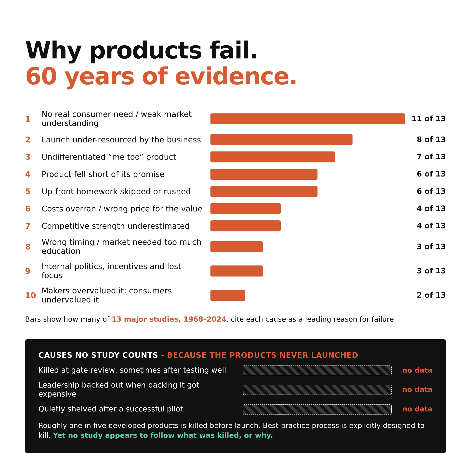
Since nobody records why individual products die, I did the next best thing: I took thirteen major studies of product failure spanning 1968 to 2024, from the original Booz Allen and Conference Board work through Robert Cooper's NewProd research programme to Nielsen's launch analyses and recent practitioner surveys, and coded which causes each one identifies. The chart that results doesn't claim to know what percentage of products die of each cause. Nobody knows that. It shows how consistently the evidence points at each one.
One cause stands alone at the top, cited by eleven of the thirteen: no real consumer need, or more precisely, an inadequate understanding of the market and the people in it. It was the leading cause in the 1968 study. It was the leading cause in the 1971 study. Cooper, summarising decades of research, writes that leaving the customer out of development and skipping the market work "are the culprits found in almost every study of why new products fail."
Look at that timeline. The single biggest killer of new products has been known, documented and ranked first for nearly sixty years. Every framework teaches it. Every insight function exists to prevent it. And it is still first. Cooper's own data shows detailed market studies are skipped in more than three quarters of projects, and that the front-end homework, the part of the process most strongly linked to success, receives about seven percent of project spend. This is not a knowledge problem. Everyone knows. It is a doing problem, and that distinction matters for everything that follows.
The second cause is the uncomfortable one
Number two on the chart, cited by eight of thirteen sources, is not a market force at all. It is the launch being under-resourced by the business that commissioned it. The budget goes on developing the product and little is left to launch, market and sell it. The sales force never believed in it. The support was withdrawn at the first soft quarter. As one of Nielsen's interviewees put it, no innovation is born big; the winners are the ones a company chooses to keep feeding.
Read that ranking again as a pair. The first cause says companies don't do the work to find out whether anyone wants the product. The second says that even when they build something, they decline to back it. Both are decisions, made inside the building, by people who in most cases knew better. The evidence on product failure, taken together, is not really a story about markets. It is a story about organisations.
And then there are the failures no study can see
Here is the part that made me want to write this piece. Every study in the chart shares a blind spot: it can only examine products that launched, or at least were tracked. But Cooper-era research recorded that roughly one in five products that enter development is killed before launch, and an older finding put the full funnel at 3,000 raw ideas for every one commercial success. Modern best practice is explicitly built around killing: Cooper advises companies to build "gates with teeth" and praises those willing to make the hard kill decision early.
Some of those kills are the system working. A gate that stops a weak product has done its job. But anyone who has spent time inside large organisations knows the other kills. The concept that tested brilliantly and died at the review because backing it was nobody's personal priority. The pilot that worked, measurably, and was shelved because scaling it would have meant admitting the existing plan was wrong. The team that watched leadership enthusiasm evaporate the moment backing the product became expensive. None of these appear in any failure statistic, anywhere, because the product never lived long enough to be counted.
So the biggest category on the chart may be the one with no bar at all.
Why there is no post-mortem culture
Which brings us back to where this started. Startups produce failure data because a failed founder has little left to protect and sometimes something to gain by writing frankly about the wreckage. A delisted product is different. The people who know why it really died still work at the company. Their careers are attached to the answer. The official reason goes in a deck; the real reason goes in the corridor. Multiply that by every launch in every category and you get the great silence that makes the product version of the startup chart impossible to draw.
The practical takeaway is not complicated, though it is uncomfortable. You cannot buy this data, but you can build your own. Run a real post-mortem on your last three launches and your last three kills, with the incentives arranged so people can tell the truth. Ask the question the sixty-year evidence trail suggests: not "what did the market do to us?" but "what did we already know, and when did we decide not to act on it?" My experience is that most organisations can answer the second question with unsettling precision, once someone makes it safe to do so.
The chart at the top of this piece shows what six decades of research can tell you. The gap below it shows what it can't. Which of your own products would sit in that gap, and who in your business could say why?
Sources: Castellion & Markham, "New Product Failure Rates", JPIM 30 (2013); Booz Allen & Hamilton, Management of New Products (1968); Hopkins & Bailey, "New-Product Pressures", The Conference Board Record (1971); Cooper, Project NewProd studies (1975-1979) and "New Products: What Separates the Winners from the Losers", PDMA Handbook, 3rd ed. (2013); Calantone & Cooper (1977); Crawford (1977, 1987); Montoya-Weiss & Calantone, JPIM (1994); Hoban (1998); Henard & Szymanski, JMR (2001); Gourville, "The Curse of Innovation", HBS (2005); Schneider & Hall, "Why Most Product Launches Fail", HBR (2011); Nielsen Breakthrough Innovation Reports (2014, 2015); van Trijp et al. (2016); Delve innovation failure-modes survey (2024); Stevens & Burley, "3,000 Raw Ideas = 1 Commercial Success!" (1997); APQC NPD benchmarking (2003); "How common is new product failure and when does it vary?", Marketing Letters (2021).
#Innovation #Strategy #FMCG #Leadership #Redebuter
Appendix: how the chart was built
The chart makes one claim and it is worth being precise about what that claim is. It does not say what percentage of products die of each cause. Nobody has that data, for the reasons the article describes. It says how many of thirteen major studies and analyses of product failure, published between 1968 and 2024, identify each cause as a leading reason products fail. The full coding is below so anyone can check the work or argue with it.
The thirteen sources
*Sources 6 and 8 study drivers of success rather than causes of failure; they are coded by inversion, so "meeting customer needs predicts success" counts as citing "no real consumer need" as a failure cause. Reasonable people can debate that move. Removing them changes no ranking materially.
The coding grid
A filled dot (●) means the source identifies that category as a leading cause of failure. An open dot (○) means the source addresses it partially or indirectly. Judgement calls are involved throughout; the two most significant are noted under the grid.
Two coding judgements worth knowing about. First, "no consumer need" and "undifferentiated product" are kept separate: a product can address a real need and still lose because it is indistinguishable from what already exists. Second, "internal politics" overlaps with "launch under-resourced": organisational dysfunction is often the reason launches end up starved. It is kept as its own row because three sources treat it as a distinct cause, but the two rows are related, and the relationship between them deserves a piece of its own.
On the claim that no study follows what was killed. There is a serious academic literature on project termination, mostly under the banner of escalation of commitment: research into why managers keep funding projects they should kill, and how organisations learn to stop. Some of that work has interviewed teams from terminated projects. What it studies is the termination decision itself. What appears not to exist is any systematic accounting of killed products as a population: what was killed, at what stage, for what stated reason, for what real reason, and how often the kill was later shown to be wrong. If such a study exists, I would genuinely like to read it, and the comments are open.
What would falsify the chart. A source-level challenge: show that one of the thirteen does not identify a coded cause, or identifies one that is missing. A structural challenge: propose a different category set and re-run the count. Both are welcome. The grid is the argument.